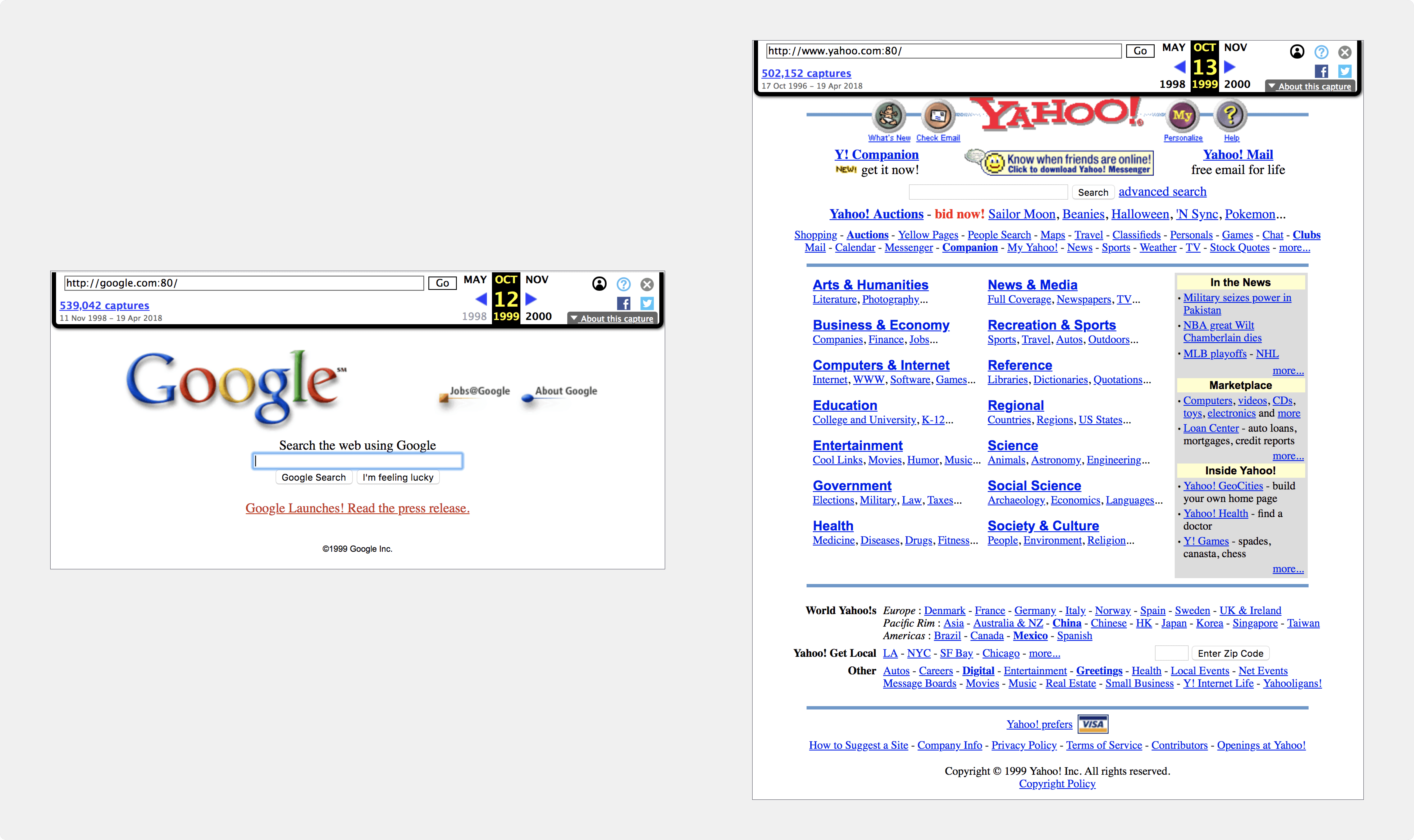
First, a history lesson: How Google ate Yahoo's lunch.
The year is 1999. Yahoo has been the biggest player on the internet for about 3 years. Google has just released a press release on the launch of their search engine. Now, take a look at these two screenshots of Google and Yahoo's homepages from October 12th, 1999, back when the internet was just picking up. Try to imagine that it's the first time you're coming across both of these pages.

Both screenshots were found using The Wayback Machine
Which one seems more inviting to use? Does one page overwhelm the senses more than the other? Google understood the value of simplicity on the internet in a period when the industry was working to show off as many of their capabilities at any given moment. And users noticed. The Google crew picked up on a notion of user experience design called the gulf of execution originally coined by Don Norman.
Understanding and reducing the gulf of execution
Consider that every time you interact with an app or a website (the user interface), you have a goal you'd like to achieve. Even if you're mindlessly scrolling through social media feeds, you have a goal. Generally, that goal is to see what your friends are up to. We know this to be true because when your path to your goal is interrupted, perhaps by an ad, perhaps by weak cell service, you're unhappy.The gulf of execution is the gap between the user's goal and the user's means to achieve that goal. In the glossary of the internet, the aforementioned 'means' are pretty much synonymous with user interface.
Google took this concept to heart from day 1 and put simplicity and usability at the forefront of its product. This isn't the only theory in academia that can positively impact your business. Hick's Law goes hand-in-hand with this thinking.
Hick's Law means you need to slim down the options. "Hick’s Law is a simple idea that says that the more choices you present your users with, the longer it will take them to reach a decision." - The Interaction Design Foundation(Source)
This is an interesting concept in the current world of digital marketing. We're constantly working to get users' attentions. And once we have it, we try really hard to provide value to the point that a visitor becomes a lead, and a lead becomes a customer, and a customer becomes a brand promoter. That's the funnel.
So, what's up with this whole notion of eliminating choice? Don't we want our users to be able to walk down whatever path they choose?
Yes, but it's our job, as designers who care about our audiences, to show them what we think is the best path. In fact, respecting a new user's time by getting them from point A to B is much more valuable than showing them every possible path. The trick is designing point B so that it can still introduce all the other interesting paths for the user.
This is great news for the busy web designer. No longer should you offer every option in your nav bar. No longer should you flesh out every detail of every offer. In fact, this theory flows into other areas of the digital marketer's world. Mailchimp sought out to find if the perfect email template exists based on data, and learned some other interesting notions, like the fact that fewer words per image denotes a higher click rate in email marketing.
So, if done correctly, we're looking at much less work in a lot of spaces. But beware - While there's perhaps less content on the landing page of your offer, that content must be even more thoughtful to succinctly and quickly lead your user to their goal.